Description
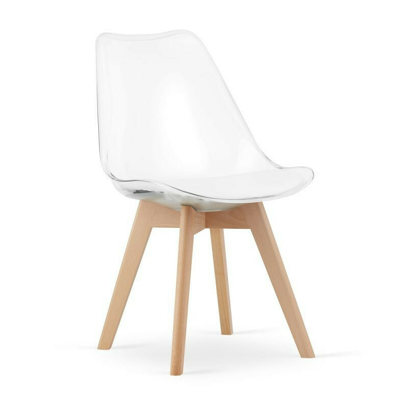
.bd-grid { display: grid; display: grid; grid-template-columns: repeat(3, minmax(0, 1fr)); row-gap: 50px; column-gap: 50px; justify-items: center; text-align: center; } @media screen and (max-width: 600px) { .bd-grid { display: grid; grid-template-columns: repeat(1, minmax(0, 1fr)); } } .bd-grid-s { display: grid; display: grid; grid-template-columns: repeat(2, minmax(0, 1fr)); row-gap: 50px; column-gap: 50px; justify-items: center; text-align: center; align-items: center; } @media screen and (max-width: 600px) { .bd-grid-s { display: grid; grid-template-columns: repeat(1, minmax(0, 1fr)); } } Set 4 scaune moderne, stil scandinav cu picioare din lemn masiv si perna din piele ecilogica, transparente Scaunele moderne cu perna sunt piesa de mobilier perfecta pentru living sau sufragerie. Designul simplu în stil scandinav face ca scaunul să arate grozav atat in interiorul modern, cat si in cel clasic. Cu forma sa interesanta, scaunul va da perfect aspectul potrivit oricarei incaperi, se potriveste biroului, restaurantului, bucatariei, dar si livingului si sufragerii. Finisajul atent al mobilierului ii mareste atractivitatea, iar designul modern si forma interesanta creeaza o combinatie perfecta chiar si pentru cei mai pretentiosi utilizatori. Scaunele sunt construite din polipropilena (plastic) transparenta. Datorita acestui lucru, puteti ajusta scaunele la orice interior. CARACTERISTICILE PRODUSULUI set de 4 scaune cu perna; scaun confortabil; design modern; Picioare din lemn de fag (cadru); Polipropilena din plastic (spatar); Sarcina admisa: 120 kg; Perna din piele ecologica de culoarea spatarului; pentru auto-asamblare (10 min). Scaun: Inaltime totala: 82 cm; Latime totala: aproximativ 50 cm; Adâncime totală: aproximativ 50 cm; Perna: Adancime: 38 cm; Latime: 44 cm; Scaun: Adancime: 42 cm; Latime: 48 cm; Inaltime de la sol: 46 cm; A sustine: Inaltime spatar: 40 cm; Lățimea cea mai mare: 48 cm; Latime in partea de sus: 30 cm; Specificație: Cod: 3752; P roducator : Multistore; Setul include: 4 scaune; Culoare: transparent; Finisaj: lemn de fag; Greutatea scaunului: 4,4 kg; Greutatea setului: aproximativ 25 kg; Ambalare: cutie de transport special securizata; Asamblare: aproximativ 5 minute; Garantie: 24 luni. .bd-grid { display: grid; display: grid; grid-template-columns: repeat(3, minmax(0, 1fr)); row-gap: 50px; column-gap: 50px; justify-items: center; text-align: center; } @media screen and (max-width: 600px) { .bd-grid { display: grid; grid-template-columns: repeat(1, minmax(0, 1fr)); } } .bd-grid-s { display: grid; display: grid; grid-template-columns: repeat(2, minmax(0, 1fr)); row-gap: 50px; column-gap: 50px; justify-items: center; text-align: center; align-items: center; } @media screen and (max-width: 600px) { .bd-grid-s { display: grid; grid-template-columns: repeat(1, minmax(0, 1fr)); } } .bd-grid { display: grid; display: grid; grid-template-columns: repeat(3, minmax(0, 1fr)); row-gap: 50px; column-gap: 50px; justify-items: center; text-align: center; } @media screen and (max-width: 600px) { .bd-grid { display: grid; grid-template-columns: repeat(1, minmax(0, 1fr)); } } .bd-grid-s { display: grid; display: grid; grid-template-columns: repeat(2, minmax(0, 1fr)); row-gap: 50px; column-gap: 50px; justify-items: center; text-align: center; align-items: center; } @media screen and (max-width: 600px) { .bd-grid-s { display: grid; grid-template-columns: repeat(1, minmax(0, 1fr)); } } .bd-grid { display: grid; display: grid; grid-template-columns: repeat(3, minmax(0, 1fr)); row-gap: 50px; column-gap: 50px; justify-items: center; text-align: center; } @media screen and (max-width: 600px) { .bd-grid { display: grid; grid-template-columns: repeat(1, minmax(0, 1fr)); } } .bd-grid-s { display: grid; display: grid; grid-template-columns: repeat(2, minmax(0, 1fr)); row-gap: 50px; column-gap: 50px; justify-items: center; text-align: center; align-items: center; } @media screen and (max-width: 600px) { .bd-grid-s { display: grid; grid-template-columns: repeat(1, minmax(0, 1fr)); } } .bd-grid { display: grid; display: grid; grid-template-columns: repeat(3, minmax(0, 1fr)); row-gap: 50px; column-gap: 50px; justify-items: center; text-align: center; } @media screen and (max-width: 600px) { .bd-grid { display: grid; grid-template-columns: repeat(1, minmax(0, 1fr)); } } .bd-grid-s { display: grid; display: grid; grid-template-columns: repeat(2, minmax(0, 1fr)); row-gap: 50px; column-gap: 50px; justify-items: center; text-align: center; align-items: center; } @media screen and (max-width: 600px) { .bd-grid-s { display: grid; grid-template-columns: repeat(1, minmax(0, 1fr)); } } .bd-grid { display: grid; display: grid; grid-template-columns: repeat(3, minmax(0, 1fr)); row-gap: 50px; column-gap: 50px; justify-items: center; text-align: center; } @media screen and (max-width: 600px) { .bd-grid { display: grid; grid-template-columns: repeat(1, minmax(0, 1fr)); } } .bd-grid-s { display: grid; display: grid; grid-template-columns: repeat(2, minmax(0, 1fr)); row-gap: 50px; column-gap: 50px; justify-items: center; text-align: center; align-items: center; } @media screen and (max-width: 600px) { .bd-grid-s { display: grid; grid-template-columns: repeat(1, minmax(0, 1fr)); } } .bd-grid { display: grid; display: grid; grid-template-columns: repeat(3, minmax(0, 1fr)); row-gap: 50px; column-gap: 50px; justify-items: center; text-align: center; } @media screen and (max-width: 600px) { .bd-grid { display: grid; grid-template-columns: repeat(1, minmax(0, 1fr)); } } .bd-grid-s { display: grid; display: grid; grid-template-columns: repeat(2, minmax(0, 1fr)); row-gap: 50px; column-gap: 50px; justify-items: center; text-align: center; align-items: center; } @media screen and (max-width: 600px) { .bd-grid-s { display: grid; grid-template-columns: repeat(1, minmax(0, 1fr)); } } .bd-grid { display: grid; display: grid; grid-template-columns: repeat(3, minmax(0, 1fr)); row-gap: 50px; column-gap: 50px; justify-items: center; text-align: center; } @media screen and (max-width: 600px) { .bd-grid { display: grid; grid-template-columns: repeat(1, minmax(0, 1fr)); } } .bd-grid-s { display: grid; display: grid; grid-template-columns: repeat(2, minmax(0, 1fr)); row-gap: 50px; column-gap: 50px; justify-items: center; text-align: center; align-items: center; } @media screen and (max-width: 600px) { .bd-grid-s { display: grid; grid-template-columns: repeat(1, minmax(0, 1fr)); } } .bd-grid { display: grid; display: grid; grid-template-columns: repeat(3, minmax(0, 1fr)); row-gap: 50px; column-gap: 50px; justify-items: center; text-align: center; } @media screen and (max-width: 600px) { .bd-grid { display: grid; grid-template-columns: repeat(1, minmax(0, 1fr)); } } .bd-grid-s { display: grid; display: grid; grid-template-columns: repeat(2, minmax(0, 1fr)); row-gap: 50px; column-gap: 50px; justify-items: center; text-align: center; align-items: center; } @media screen and (max-width: 600px) { .bd-grid-s { display: grid; grid-template-columns: repeat(1, minmax(0, 1fr)); } } .bd-grid { display: grid; display: grid; grid-template-columns: repeat(3, minmax(0, 1fr)); row-gap: 50px; column-gap: 50px; justify-items: center; text-align: center; } @media screen and (max-width: 600px) { .bd-grid { display: grid; grid-template-columns: repeat(1, minmax(0, 1fr)); } } .bd-grid-s { display: grid; display: grid; grid-template-columns: repeat(2, minmax(0, 1fr)); row-gap: 50px; column-gap: 50px; justify-items: center; text-align: center; align-items: center; } @media screen and (max-width: 600px) { .bd-grid-s { display: grid; grid-template-columns: repeat(1, minmax(0, 1fr)); } } .bd-grid { display: grid; display: grid; grid-template-columns: repeat(3, minmax(0, 1fr)); row-gap: 50px; column-gap: 50px; justify-items: center; text-align: center; } @media screen and (max-width: 600px) { .bd-grid { display: grid; grid-template-columns: repeat(1, minmax(0, 1fr)); } } .bd-grid-s { display: grid; display: grid; grid-template-columns: repeat(2, minmax(0, 1fr)); row-gap: 50px; column-gap: 50px; justify-items: center; text-align: center; align-items: center; } @media screen and (max-width: 600px) { .bd-grid-s { display: grid; grid-template-columns: repeat(1, minmax(0, 1fr)); } } .bd-grid { display: grid; display: grid; grid-template-columns: repeat(3, minmax(0, 1fr)); row-gap: 50px; column-gap: 50px; justify-items: center; text-align: center; } @media screen and (max-width: 600px) { .bd-grid { display: grid; grid-template-columns: repeat(1, minmax(0, 1fr)); } } .bd-grid-s { display: grid; display: grid; grid-template-columns: repeat(2, minmax(0, 1fr)); row-gap: 50px; column-gap: 50px; justify-items: center; text-align: center; align-items: center; } @media screen and (max-width: 600px) { .bd-grid-s { display: grid; grid-template-columns: repeat(1, minmax(0, 1fr)); } } .bd-grid { display: grid; display: grid; grid-template-columns: repeat(3, minmax(0, 1fr)); row-gap: 50px; column-gap: 50px; justify-items: center; text-align: center; } @media screen and (max-width: 600px) { .bd-grid { display: grid; grid-template-columns: repeat(1, minmax(0, 1fr)); } } .bd-grid-s { display: grid; display: grid; grid-template-columns: repeat(2, minmax(0, 1fr)); row-gap: 50px; column-gap: 50px; justify-items: center; text-align: center; align-items: center; } @media screen and (max-width: 600px) { .bd-grid-s { display: grid; grid-template-columns: repeat(1, minmax(0, 1fr)); } } .bd-grid { display: grid; display: grid; grid-template-columns: repeat(3, minmax(0, 1fr)); row-gap: 50px; column-gap: 50px; justify-items: center; text-align: center; } @media screen and (max-width: 600px) { .bd-grid { display: grid; grid-template-columns: repeat(1, minmax(0, 1fr)); } } .bd-grid-s { display: grid; display: grid; grid-template-columns: repeat(2, minmax(0, 1fr)); row-gap: 50px; column-gap: 50px; justify-items: center; text-align: center; align-items: center; } @media screen and (max-width: 600px) { .bd-grid-s { display: grid; grid-template-columns: repeat(1, minmax(0, 1fr)); } } .bd-grid { display: grid; display: grid; grid-template-columns: repeat(3, minmax(0, 1fr)); row-gap: 50px; column-gap: 50px; justify-items: center; text-align: center; } @media screen and (max-width: 600px) { .bd-grid { display: grid; grid-template-columns: repeat(1, minmax(0, 1fr)); } } .bd-grid-s { display: grid; display: grid; grid-template-columns: repeat(2, minmax(0, 1fr)); row-gap: 50px; column-gap: 50px; justify-items: center; text-align: center; align-items: center; } @media screen and (max-width: 600px) { .bd-grid-s { display: grid; grid-template-columns: repeat(1, minmax(0, 1fr)); } } .bd-grid { display: grid; display: grid; grid-template-columns: repeat(3, minmax(0, 1fr)); row-gap: 50px; column-gap: 50px; justify-items: center; text-align: center; } @media screen and (max-width: 600px) { .bd-grid { display: grid; grid-template-columns: repeat(1, minmax(0, 1fr)); } } .bd-grid-s { display: grid; display: grid; grid-template-columns: repeat(2, minmax(0, 1fr)); row-gap: 50px; column-gap: 50px; justify-items: center; text-align: center; align-items: center; } @media screen and (max-width: 600px) { .bd-grid-s { display: grid; grid-template-columns: repeat(1, minmax(0, 1fr)); } } .bd-grid { display: grid; display: grid; grid-template-columns: repeat(3, minmax(0, 1fr)); row-gap: 50px; column-gap: 50px; justify-items: center; text-align: center; } @media screen and (max-width: 600px) { .bd-grid { display: grid; grid-template-columns: repeat(1, minmax(0, 1fr)); } } .bd-grid-s { display: grid; display: grid; grid-template-columns: repeat(2, minmax(0, 1fr)); row-gap: 50px; column-gap: 50px; justify-items: center; text-align: center; align-items: center; } @media screen and (max-width: 600px) { .bd-grid-s { display: grid; grid-template-columns: repeat(1, minmax(0, 1fr)); } } .bd-grid { display: grid; display: grid; grid-template-columns: repeat(3, minmax(0, 1fr)); row-gap: 50px; column-gap: 50px; justify-items: center; text-align: center; } @media screen and (max-width: 600px) { .bd-grid { display: grid; grid-template-columns: repeat(1, minmax(0, 1fr)); } } .bd-grid-s { display: grid; display: grid; grid-template-columns: repeat(2, minmax(0, 1fr)); row-gap: 50px; column-gap: 50px; justify-items: center; text-align: center; align-items: center; } @media screen and (max-width: 600px) { .bd-grid-s { display: grid; grid-template-columns: repeat(1, minmax(0, 1fr)); } } .bd-grid { display: grid; display: grid; grid-template-columns: repeat(3, minmax(0, 1fr)); row-gap: 50px; column-gap: 50px; justify-items: center; text-align: center; } @media screen and (max-width: 600px) { .bd-grid { display: grid; grid-template-columns: repeat(1, minmax(0, 1fr)); } } .bd-grid-s { display: grid; display: grid; grid-template-columns: repeat(2, minmax(0, 1fr)); row-gap: 50px; column-gap: 50px; justify-items: center; text-align: center; align-items: center; } @media screen and (max-width: 600px) { .bd-grid-s { display: grid; grid-template-columns: repeat(1, minmax(0, 1fr)); } } .bd-grid { display: grid; display: grid; grid-template-columns: repeat(3, minmax(0, 1fr)); row-gap: 50px; column-gap: 50px; justify-items: center; text-align: center; } @media screen and (max-width: 600px) { .bd-grid { display: grid; grid-template-columns: repeat(1, minmax(0, 1fr)); } } .bd-grid-s { display: grid; display: grid; grid-template-columns: repeat(2, minmax(0, 1fr)); row-gap: 50px; column-gap: 50px; justify-items: center; text-align: center; align-items: center; } @media screen and (max-width: 600px) { .bd-grid-s { display: grid; grid-template-columns: repeat(1, minmax(0, 1fr)); } } .bd-grid { display: grid; display: grid; grid-template-columns: repeat(3, minmax(0, 1fr)); row-gap: 50px; column-gap: 50px; justify-items: center; text-align: center; } @media screen and (max-width: 600px) { .bd-grid { display: grid; grid-template-columns: repeat(1, minmax(0, 1fr)); } } .bd-grid-s { display: grid; display: grid; grid-template-columns: repeat(2, minmax(0, 1fr)); row-gap: 50px; column-gap: 50px; justify-items: center; text-align: center; align-items: center; } @media screen and (max-width: 600px) { .bd-grid-s { display: grid; grid-template-columns: repeat(1, minmax(0, 1fr)); } } .bd-grid { display: grid; display: grid; grid-template-columns: repeat(3, minmax(0, 1fr)); row-gap: 50px; column-gap: 50px; justify-items: center; text-align: center; } @media screen and (max-width: 600px) { .bd-grid { display: grid; grid-template-columns: repeat(1, minmax(0, 1fr)); } } .bd-grid-s { display: grid; display: grid; grid-template-columns: repeat(2, minmax(0, 1fr)); row-gap: 50px; column-gap: 50px; justify-items: center; text-align: center; align-items: center; } @media screen and (max-width: 600px) { .bd-grid-s { display: grid; grid-template-columns: repeat(1, minmax(0, 1fr)); } } .bd-grid { display: grid; display: grid; grid-template-columns: repeat(3, minmax(0, 1fr)); row-gap: 50px; column-gap: 50px; justify-items: center; text-align: center; } @media screen and (max-width: 600px) { .bd-grid { display: grid; grid-template-columns: repeat(1, minmax(0, 1fr)); } } .bd-grid-s { display: grid; display: grid; grid-template-columns: repeat(2, minmax(0, 1fr)); row-gap: 50px; column-gap: 50px; justify-items: center; text-align: center; align-items: center; } @media screen and (max-width: 600px) { .bd-grid-s { display: grid; grid-template-columns: repeat(1, minmax(0, 1fr)); } } .bd-grid { display: grid; display: grid; grid-template-columns: repeat(3, minmax(0, 1fr)); row-gap: 50px; column-gap: 50px; justify-items: center; text-align: center; } @media screen and (max-width: 600px) { .bd-grid { display: grid; grid-template-columns: repeat(1, minmax(0, 1fr)); } } .bd-grid-s { display: grid; display: grid; grid-template-columns: repeat(2, minmax(0, 1fr)); row-gap: 50px; column-gap: 50px; justify-items: center; text-align: center; align-items: center; } @media screen and (max-width: 600px) { .bd-grid-s { display: grid; grid-template-columns: repeat(1, minmax(0, 1fr)); } } .bd-grid { display: grid; display: grid; grid-template-columns: repeat(3, minmax(0, 1fr)); row-gap: 50px; column-gap: 50px; justify-items: center; text-align: center; } @media screen and (max-width: 600px) { .bd-grid { display: grid; grid-template-columns: repeat(1, minmax(0, 1fr)); } } .bd-grid-s { display: grid; display: grid; grid-template-columns: repeat(2, minmax(0, 1fr)); row-gap: 50px; column-gap: 50px; justify-items: center; text-align: center; align-items: center; } @media screen and (max-width: 600px) { .bd-grid-s { display: grid; grid-template-columns: repeat(1, minmax(0, 1fr)); } } .bd-grid { display: grid; display: grid; grid-template-columns: repeat(3, minmax(0, 1fr)); row-gap: 50px; column-gap: 50px; justify-items: center; text-align: center; } @media screen and (max-width: 600px) { .bd-grid { display: grid; grid-template-columns: repeat(1, minmax(0, 1fr)); } } .bd-grid-s { display: grid; display: grid; grid-template-columns: repeat(2, minmax(0, 1fr)); row-gap: 50px; column-gap: 50px; justify-items: center; text-align: center; align-items: center; } @media screen and (max-width: 600px) { .bd-grid-s { display: grid; grid-template-columns: repeat(1, minmax(0, 1fr)); } } .bd-grid { display: grid; display: grid; grid-template-columns: repeat(3, minmax(0, 1fr)); row-gap: 50px; column-gap: 50px; justify-items: center; text-align: center; } @media screen and (max-width: 600px) { .bd-grid { display: grid; grid-template-columns: repeat(1, minmax(0, 1fr)); } } .bd-grid-s { display: grid; display: grid; grid-template-columns: repeat(2, minmax(0, 1fr)); row-gap: 50px; column-gap: 50px; justify-items: center; text-align: center; align-items: center; } @media screen and (max-width: 600px) { .bd-grid-s { display: grid; grid-template-columns: repeat(1, minmax(0, 1fr)); } } .bd-grid { display: grid; display: grid; grid-template-columns: repeat(3, minmax(0, 1fr)); row-gap: 50px; column-gap: 50px; justify-items: center; text-align: center; } @media screen and (max-width: 600px) { .bd-grid { display: grid; grid-template-columns: repeat(1, minmax(0, 1fr)); } } .bd-grid-s { display: grid; display: grid; grid-template-columns: repeat(2, minmax(0, 1fr)); row-gap: 50px; column-gap: 50px; justify-items: center; text-align: center; align-items: center; } @media screen and (max-width: 600px) { .bd-grid-s { display: grid; grid-template-columns: repeat(1, minmax(0, 1fr)); } } .bd-grid { display: grid; display: grid; grid-template-columns: repeat(3, minmax(0, 1fr)); row-gap: 50px; column-gap: 50px; justify-items: center; text-align: center; } @media screen and (max-width: 600px) { .bd-grid { display: grid; grid-template-columns: repeat(1, minmax(0, 1fr)); } } .bd-grid-s { display: grid; display: grid; grid-template-columns: repeat(2, minmax(0, 1fr)); row-gap: 50px; column-gap: 50px; justify-items: center; text-align: center; align-items: center; } @media screen and (max-width: 600px) { .bd-grid-s { display: grid; grid-template-columns: repeat(1, minmax(0, 1fr)); } } .bd-grid { display: grid; display: grid; grid-template-columns: repeat(3, minmax(0, 1fr)); row-gap: 50px; column-gap: 50px; justify-items: center; text-align: center; } @media screen and (max-width: 600px) { .bd-grid { display: grid; grid-template-columns: repeat(1, minmax(0, 1fr)); } } .bd-grid-s { display: grid; display: grid; grid-template-columns: repeat(2, minmax(0, 1fr)); row-gap: 50px; column-gap: 50px; justify-items: center; text-align: center; align-items: center; } @media screen and (max-width: 600px) { .bd-grid-s { display: grid; grid-template-columns: repeat(1, minmax(0, 1fr)); } } .bd-grid { display: grid; display: grid; grid-template-columns: repeat(3, minmax(0, 1fr)); row-gap: 50px; column-gap: 50px; justify-items: center; text-align: center; } @media screen and (max-width: 600px) { .bd-grid { display: grid; grid-template-columns: repeat(1, minmax(0, 1fr)); } } .bd-grid-s { display: grid; display: grid; grid-template-columns: repeat(2, minmax(0, 1fr)); row-gap: 50px; column-gap: 50px; justify-items: center; text-align: center; align-items: center; } @media screen and (max-width: 600px) { .bd-grid-s { display: grid; grid-template-columns: repeat(1, minmax(0, 1fr)); } } .bd-grid { display: grid; display: grid; grid-template-columns: repeat(3, minmax(0, 1fr)); row-gap: 50px; column-gap: 50px; justify-items: center; text-align: center; } @media screen and (max-width: 600px) { .bd-grid { display: grid; grid-template-columns: repeat(1, minmax(0, 1fr)); } } .bd-grid-s { display: grid; display: grid; grid-template-columns: repeat(2, minmax(0, 1fr)); row-gap: 50px; column-gap: 50px; justify-items: center; text-align: center; align-items: center; } @media screen and (max-width: 600px) { .bd-grid-s { display: grid; grid-template-columns: repeat(1, minmax(0, 1fr)); } } .bd-grid { display: grid; display: grid; grid-template-columns: repeat(3, minmax(0, 1fr)); row-gap: 50px; column-gap: 50px; justify-items: center; text-align: center; } @media screen and (max-width: 600px) { .bd-grid { display: grid; grid-template-columns: repeat(1, minmax(0, 1fr)); } } .bd-grid-s { display: grid; display: grid; grid-template-columns: repeat(2, minmax(0, 1fr)); row-gap: 50px; column-gap: 50px; justify-items: center; text-align: center; align-items: center; } @media screen and (max-width: 600px) { .bd-grid-s { display: grid; grid-template-columns: repeat(1, minmax(0, 1fr)); } } .bd-grid { display: grid; display: grid; grid-template-columns: repeat(3, minmax(0, 1fr)); row-gap: 50px; column-gap: 50px; justify-items: center; text-align: center; } @media screen and (max-width: 600px) { .bd-grid { display: grid; grid-template-columns: repeat(1, minmax(0, 1fr)); } } .bd-grid-s { display: grid; display: grid; grid-template-columns: repeat(2, minmax(0, 1fr)); row-gap: 50px; column-gap: 50px; justify-items: center; text-align: center; align-items: center; } @media screen and (max-width: 600px) { .bd-grid-s { display: grid; grid-template-columns: repeat(1, minmax(0, 1fr)); } } .bd-grid { display: grid; display: grid; grid-template-columns: repeat(3, minmax(0, 1fr)); row-gap: 50px; column-gap: 50px; justify-items: center; text-align: center; } @media screen and (max-width: 600px) { .bd-grid { display: grid; grid-template-columns: repeat(1, minmax(0, 1fr)); } } .bd-grid-s { display: grid; display: grid; grid-template-columns: repeat(2, minmax(0, 1fr)); row-gap: 50px; column-gap: 50px; justify-items: center; text-align: center; align-items: center; } @media screen and (max-width: 600px) { .bd-grid-s { display: grid; grid-template-columns: repeat(1, minmax(0, 1fr)); } } .bd-grid { display: grid; display: grid; grid-template-columns: repeat(3, minmax(0, 1fr)); row-gap: 50px; column-gap: 50px; justify-items: center; text-align: center; } @media screen and (max-width: 600px) { .bd-grid { display: grid; grid-template-columns: repeat(1, minmax(0, 1fr)); } } .bd-grid-s { display: grid; display: grid; grid-template-columns: repeat(2, minmax(0, 1fr)); row-gap: 50px; column-gap: 50px; justify-items: center; text-align: center; align-items: center; } @media screen and (max-width: 600px) { .bd-grid-s { display: grid; grid-template-columns: repeat(1, minmax(0, 1fr)); } } .bd-grid { display: grid; display: grid; grid-template-columns: repeat(3, minmax(0, 1fr)); row-gap: 50px; column-gap: 50px; justify-items: center; text-align: center; } @media screen and (max-width: 600px) { .bd-grid { display: grid; grid-template-columns: repeat(1, minmax(0, 1fr)); } } .bd-grid-s { display: grid; display: grid; grid-template-columns: repeat(2, minmax(0, 1fr)); row-gap: 50px; column-gap: 50px; justify-items: center; text-align: center; align-items: center; } @media screen and (max-width: 600px) { .bd-grid-s { display: grid; grid-template-columns: repeat(1, minmax(0, 1fr)); } } .bd-grid { display: grid; display: grid; grid-template-columns: repeat(3, minmax(0, 1fr)); row-gap: 50px; column-gap: 50px; justify-items: center; text-align: center; } @media screen and (max-width: 600px) { .bd-grid { display: grid; grid-template-columns: repeat(1, minmax(0, 1fr)); } } .bd-grid-s { display: grid; display: grid; grid-template-columns: repeat(2, minmax(0, 1fr)); row-gap: 50px; column-gap: 50px; justify-items: center; text-align: center; align-items: center; } @media screen and (max-width: 600px) { .bd-grid-s { display: grid; grid-template-columns: repeat(1, minmax(0, 1fr)); } } .bd-grid { display: grid; display: grid; grid-template-columns: repeat(3, minmax(0, 1fr)); row-gap: 50px; column-gap: 50px; justify-items: center; text-align: center; } @media screen and (max-width: 600px) { .bd-grid { display: grid; grid-template-columns: repeat(1, minmax(0, 1fr)); } } .bd-grid-s { display: grid; display: grid; grid-template-columns: repeat(2, minmax(0, 1fr)); row-gap: 50px; column-gap: 50px; justify-items: center; text-align: center; align-items: center; } @media screen and (max-width: 600px) { .bd-grid-s { display: grid; grid-template-columns: repeat(1, minmax(0, 1fr)); } } .bd-grid { display: grid; display: grid; grid-template-columns: repeat(3, minmax(0, 1fr)); row-gap: 50px; column-gap: 50px; justify-items: center; text-align: center; } @media screen and (max-width: 600px) { .bd-grid { display: grid; grid-template-columns: repeat(1, minmax(0, 1fr)); } } .bd-grid-s { display: grid; display: grid; grid-template-columns: repeat(2, minmax(0, 1fr)); row-gap: 50px; column-gap: 50px; justify-items: center; text-align: center; align-items: center; } @media screen and (max-width: 600px) { .bd-grid-s { display: grid; grid-template-columns: repeat(1, minmax(0, 1fr)); } } .bd-grid { display: grid; display: grid; grid-template-columns: repeat(3, minmax(0, 1fr)); row-gap: 50px; column-gap: 50px; justify-items: center; text-align: center; } @media screen and (max-width: 600px) { .bd-grid { display: grid; grid-template-columns: repeat(1, minmax(0, 1fr)); } } .bd-grid-s { display: grid; display: grid; grid-template-columns: repeat(2, minmax(0, 1fr)); row-gap: 50px; column-gap: 50px; justify-items: center; text-align: center; align-items: center; } @media screen and (max-width: 600px) { .bd-grid-s { display: grid; grid-template-columns: repeat(1, minmax(0, 1fr)); } } .bd-grid { display: grid; display: grid; grid-template-columns: repeat(3, minmax(0, 1fr)); row-gap: 50px; column-gap: 50px; justify-items: center; text-align: center; } @media screen and (max-width: 600px) { .bd-grid { display: grid; grid-template-columns: repeat(1, minmax(0, 1fr)); } } .bd-grid-s { display: grid; display: grid; grid-template-columns: repeat(2, minmax(0, 1fr)); row-gap: 50px; column-gap: 50px; justify-items: center; text-align: center; align-items: center; } @media screen and (max-width: 600px) { .bd-grid-s { display: grid; grid-template-columns: repeat(1, minmax(0, 1fr)); } } .bd-grid { display: grid; display: grid; grid-template-columns: repeat(3, minmax(0, 1fr)); row-gap: 50px; column-gap: 50px; justify-items: center; text-align: center; } @media screen and (max-width: 600px) { .bd-grid { display: grid; grid-template-columns: repeat(1, minmax(0, 1fr)); } } .bd-grid-s { display: grid; display: grid; grid-template-columns: repeat(2, minmax(0, 1fr)); row-gap: 50px; column-gap: 50px; justify-items: center; text-align: center; align-items: center; } @media screen and (max-width: 600px) { .bd-grid-s { display: grid; grid-template-columns: repeat(1, minmax(0, 1fr)); } } .bd-grid { display: grid; display: grid; grid-template-columns: repeat(3, minmax(0, 1fr)); row-gap: 50px; column-gap: 50px; justify-items: center; text-align: center; } @media screen and (max-width: 600px) { .bd-grid { display: grid; grid-template-columns: repeat(1, minmax(0, 1fr)); } } .bd-grid-s { display: grid; display: grid; grid-template-columns: repeat(2, minmax(0, 1fr)); row-gap: 50px; column-gap: 50px; justify-items: center; text-align: center; align-items: center; } @media screen and (max-width: 600px) { .bd-grid-s { display: grid; grid-template-columns: repeat(1, minmax(0, 1fr)); } }
Reviews
There are no reviews yet.